As far as public libraries, there's a decent amount of choice when it comes to comics. It seems at least at my local branch that graphic novels are awarded their own area, which makes it convenient, yes, but only once you find thing thing. It's set aside within a pair of shelves that's supposed to be their "Young Adult" section. It's on the opposite side of the library of the Children's section and actually set very close to one of three sets of racks of Romance Novels. I was surprised that this designation existed, though happy. However, I entirely missed it upon entering. All I saw in the catalog was "YA Graphic Novel" as the designations, then it was separated by author's names. The shelf itself had a lot of American graphic novels along with a few manga (Japanese graphic novels) mixed in. The selection wasn't awful I guess, including work by Neil Gaiman, the first book in the "Maus" series, a splattering of super hero books, and several from the "Bone" series as well. I personally didn't care for the style of organization, however my particular branch is a rather small one.
As a reader, I prefer college libraries for organization of graphic novels. Admittedly, they don't have the same concerns for a children's section and such. At my community college, there is a long line of shelves against the wall with fiction of various sorts. You can find graphic novels mixed within the rest of the shelves though, I believe around the art section. They actually house "Watchmen" as well as most if not all of the "Sandman" series, among other well known titles.
Something I've seen at book stores, but not so much as libraries has been a collection of graphic novels that sort of retell classic works, like "Hamlet" in comic form. I think that sort of thing would appeal to young people. I mean, Shakespeare is hard for a lot of us and (in my opinion) is better to see acted out or hear out loud. I feel that seeing it in the form of a comic could easily draw people in though, and make use of images that were only alluded to even on stage.
Showing posts with label *comics. Show all posts
Showing posts with label *comics. Show all posts
Saturday, February 27, 2010

Thursday, February 25, 2010
Sandman Analysis
Using one of the comics or graphic novels in the text or one of your own choice, analyze/discuss the relations between pictures and text, and how the story develops between frames and from frame to frame.
A favorite graphic novel of mine was mentioned in the text, though I was unsure if I should tackle it. Since it came up, I figured, why not? I’ll be using Neil Gaiman’s Sandman as my example. I highly recommend it to adults, as it tackles some very adult-style situations and has its fair share of graphic images. As the series is rather long, I’ll just pull from the first issue, "The Sleep of the Just". The story of this issue is June 6, 1916, an English man named Roderick Burgess and a cult of men try to summon up Death, but instead they get Death's brother Dream. Through different matters and after decades of waiting, eventually Dream gets free of his enchanted prison. He punishes those that trapped him then starts going about fixing what has been injured by his absence.
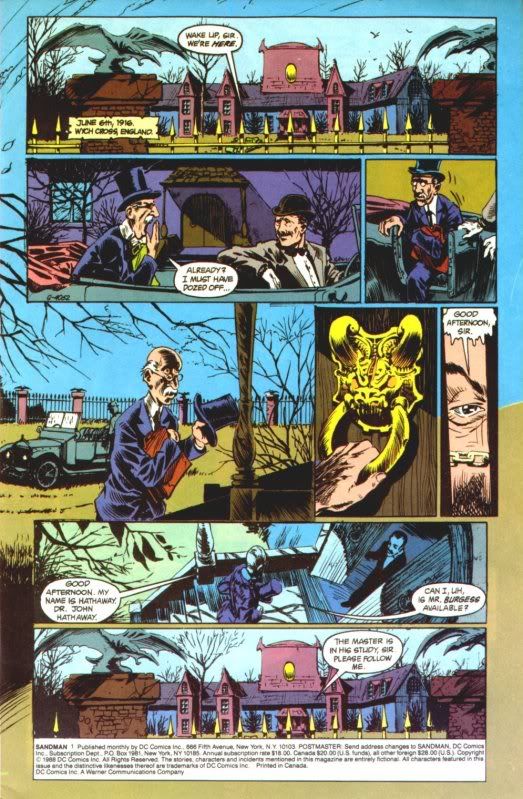
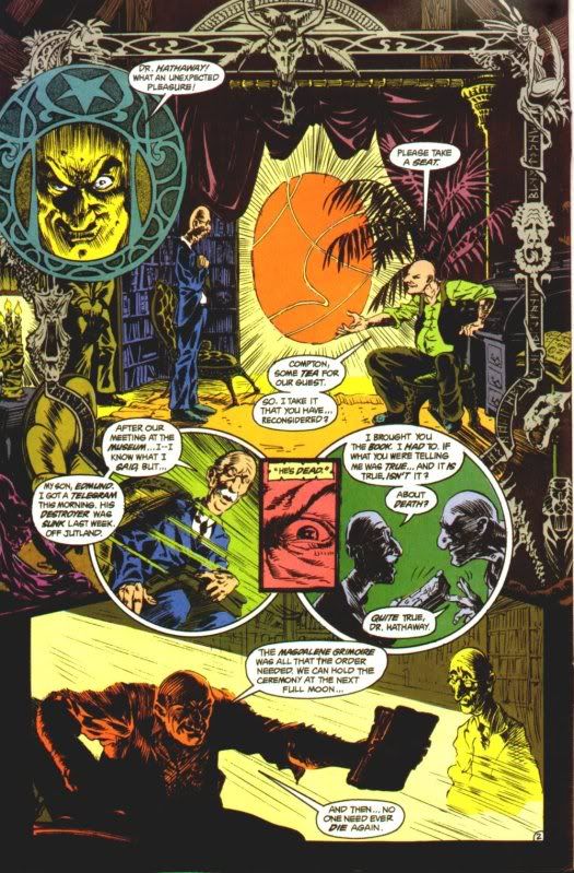
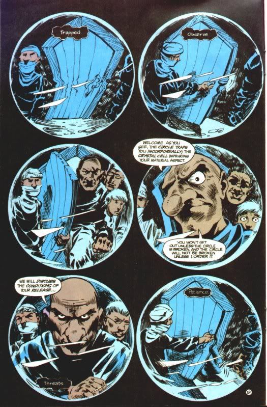
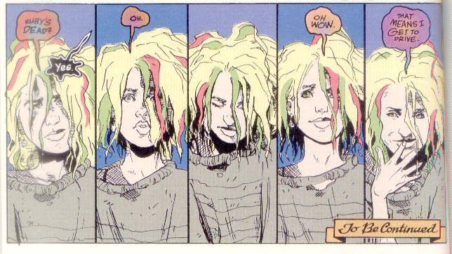
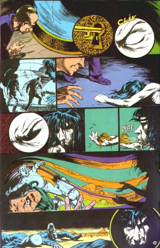
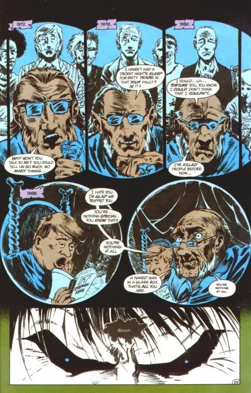
As you read a comic, you eye is drawn to read as you might normally do so, left to right and from the top to the bottom. This is much the same for this comic. With this, text isn't always required. As we see in the first page there are are 8 panels and 7 word bubbles, with 4 of the bubbles being paired. We can still this this man is nervous about entering this house. The concentration on the elaborate knocker, the eye peering from a cracked door, we can see why. There is obviously something afoot, though the text has not revealed as much to us, the reader. The second page really gives us more information with the text, but little through the images. Here, they're more used to convey a certain feeling. You can tell that though Burgess has used his mission of trapping Death to get what he needs by influencing others with it, you can tell by his looks that he doesn't care about other people's feelings or interest. He wants Death under his thumb for his own reasons. This page takes a different manner of vision, as we see things from Dream's point of view from within his glass prison. The world is warped, and it's interesting to notice that Dream's thoughts appear with a black background, like the night sky. As the series continues, all of Dream's siblings (As seen with Delirium ) also have their own special style of text and speech bubbles. Then here is the page where Dream makes his escape. The previous page had the guards discussing whether or not he was dead, and here we see he has tricked them. There is not one text block on this page, the only words appearing are to show sounds and emphasize actions. But the story here is clear. Finally, a technique I personally like! Though we've seen progression of action via frames, here we see progression of time. The characters don't move, but they age and even without the year at the top, we would still understand that they were aging. Gaiman I've seen use this technique more than once and I personally rather like it.
A favorite graphic novel of mine was mentioned in the text, though I was unsure if I should tackle it. Since it came up, I figured, why not? I’ll be using Neil Gaiman’s Sandman as my example. I highly recommend it to adults, as it tackles some very adult-style situations and has its fair share of graphic images. As the series is rather long, I’ll just pull from the first issue, "The Sleep of the Just". The story of this issue is June 6, 1916, an English man named Roderick Burgess and a cult of men try to summon up Death, but instead they get Death's brother Dream. Through different matters and after decades of waiting, eventually Dream gets free of his enchanted prison. He punishes those that trapped him then starts going about fixing what has been injured by his absence.
As you read a comic, you eye is drawn to read as you might normally do so, left to right and from the top to the bottom. This is much the same for this comic. With this, text isn't always required. As we see in the first page there are are 8 panels and 7 word bubbles, with 4 of the bubbles being paired. We can still this this man is nervous about entering this house. The concentration on the elaborate knocker, the eye peering from a cracked door, we can see why. There is obviously something afoot, though the text has not revealed as much to us, the reader. The second page really gives us more information with the text, but little through the images. Here, they're more used to convey a certain feeling. You can tell that though Burgess has used his mission of trapping Death to get what he needs by influencing others with it, you can tell by his looks that he doesn't care about other people's feelings or interest. He wants Death under his thumb for his own reasons. This page takes a different manner of vision, as we see things from Dream's point of view from within his glass prison. The world is warped, and it's interesting to notice that Dream's thoughts appear with a black background, like the night sky. As the series continues, all of Dream's siblings (As seen with Delirium ) also have their own special style of text and speech bubbles. Then here is the page where Dream makes his escape. The previous page had the guards discussing whether or not he was dead, and here we see he has tricked them. There is not one text block on this page, the only words appearing are to show sounds and emphasize actions. But the story here is clear. Finally, a technique I personally like! Though we've seen progression of action via frames, here we see progression of time. The characters don't move, but they age and even without the year at the top, we would still understand that they were aging. Gaiman I've seen use this technique more than once and I personally rather like it.
Subscribe to:
Posts (Atom)